


And it probably was...once. The cabinets were solid wood, no veneer or particle board. There was a 48" fridge (which start at $8000, FYI), two dishwashers, a gas stove, two ovens, and a trash compactor-- and not a single one of them worked! Every single appliance was trashed. And when I say trashed, I mean one step shy of being condemned to hell. The fridge was stained inside, missing shelves in both fridge and freezer, missing the ice machine entirely, and the whole insert of the water/ice maker was gone, leaving a gaping hole where the dispenser should be. Both dishwashers were missing one or both dish racks, and both had char, CHAR!, inside, like something had been lit and left to burn in there!

The trash compactor we won't even speak of. Such filth is not to be imagined. And the poor cabinets, on closer inspection, were dented, scratched, and foul beyond all reason. Even a cleaning crew would not have been enough to induce me to put anything in them. The one thing that appeared to be unscathed was the vomit-colored granite. Uh, no. The island was a strange angular 's' shape. The Tiffany style lights were coated in 11 years worth of grease and grime (and were plastic to boot). And the whole kitchen was very very dark. Just not a lot of light coming in. The only thing I liked was a recessed highboy (dish hutch). It was clean and in nearly perfect shape. But there was no way to save that, so we decided the only thing to do was to rip it all out. We were going to throw the whole kitchen away because I didn't think anyone would want a kitchen like that. But I listed it on Craigslist and within 15 minutes had a dozen texts and calls. One guy wanted it so badly he came that night, in the pitch dark (no lights in the house worked) and removed it then and there, piece by piece.
Our new plan consisted of white cabinets in a very plain shaker style, taking away the eat-in dining room and using that whole area as kitchen space. We would move the dining area into the adjoining room (formerly the family room). The kitchen layout would change a bit to allow a large 5x3' island with no sink or stove in it that would seat 5.
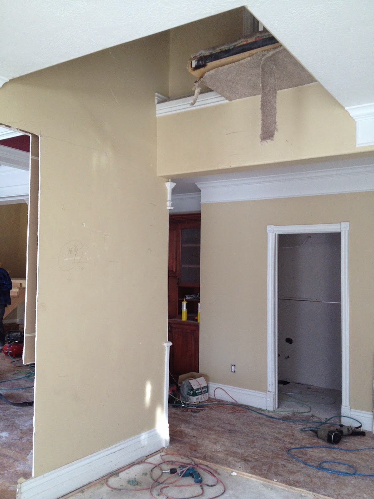
The biggest structural change was on the wall where the dish hutch was. Behind it was a full bath. A FULL bath, with a bath tub...right off the main hallway and kitchen. Like, who takes a bath there? "Oh, I'm just going to wash up while all the neighbors walk by and then walk out into the kitchen in my towel. Laalalaalalaaa." Bizarre. And the dish hutch intruded 2ft into that room, about midway, creating a sort of old fashioned key shape to the room. So we decided that niche would be knocked out and the bathroom would be split in half. One half would become a powder room, and the other half would become a hidden walk-in pantry.
.JPG)
Work began at once and pretty soon the entire room was a big mess....


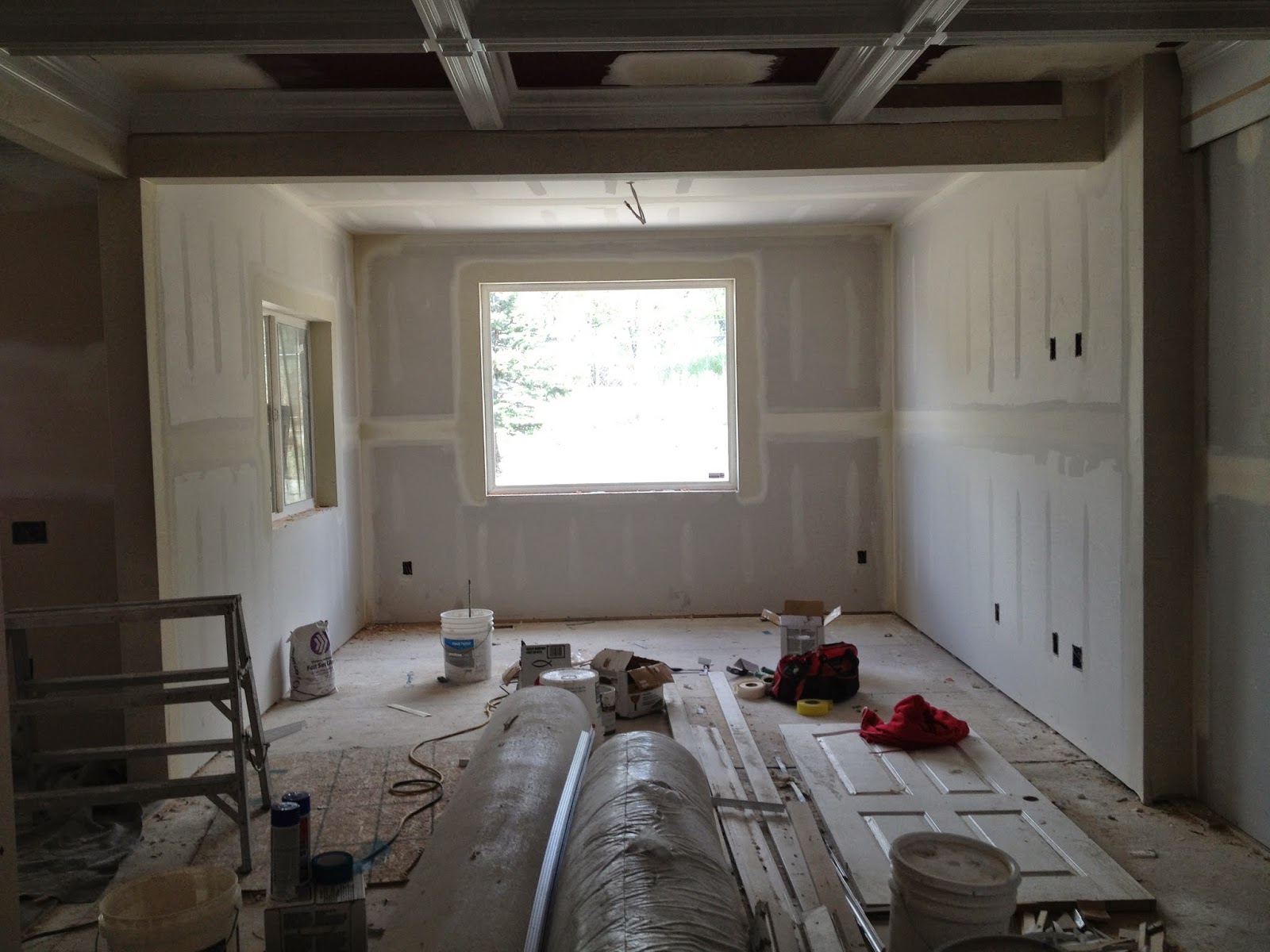
But after the construction was done, the rooms made a lot more sense. The construction choices had been difficult because they were all theoretical (in terms of the sizes and positions of the rooms, etc.), so it was a relief to see them framed in and to realize they would be functional.


Next we got the counter tops measured and ordered (a special SPECIAL thanks to my old friend Matt for the amazing Silestone counters. They are gorgeous!!!). We choose Silestone because A) I despise granite. That busy, splotchy look, not to mention its ubiquity here in Utah, have always been a total turn off to me. And B) marble and granite require more care. They have pits and have to be sealed to prevent germs from getting caught in those pits and other nasty things I don't want to think about. So the smooth, germ-resistant, indestructibility of quartz was definitely the direction I wanted to go. And this "Tigris Sand"sample I picked up at the Home Depot was exactly the beachy color I wanted to warm up the crisp white of the cabinets and backsplash.

Speaking of the backsplash, that was a fun decision. I'd already spent loads of time at the tile stores when I chose tile for the floor. This time I actually knew exactly what I wanted: white penny tile. I knew before we even started that I wanted penny tile somewhere in the house. But I quickly rejected it as a floor tile because of the amount of grout there is. (Can you say stains??) So the kitchen backsplash seemed the perfect place. Only, once it was in and they asked me what grout color I wanted, I did have a moment of panic. White was too stark (and too easily stained). And it also made the white tiles sort of disappear. I found tons of pictures on Houzz and Pinterest with grey or charcoal grout. But again, the contrast was very stark and actually made the grout look it was dirty. So I made a snap decision to match the grout to the counter tops--that sort of warm, sandy color. Then I just crossed my fingers and hoped that it would turn out well because grout is not something you can change later! And, fortunately, I loved how it turned out. It allowed the white tiles to pop and really catch your eye.


Where the full bathroom once was, there was now a hidden, walk-in pantry. I had it painted a nice sunny yellow, then I painted on the quatre-foil with a stencil. My sweet father-in-law and husband spent the better part of a day hanging the obnxious Ikea shelves I got for it. But in the end, it was such a good architectural decision to take out the bathtub and put in this pantry!


So, finally, a day before we moved in (most of) the appliances were put in. We ended up having to chuck the 48" fridge we'd hung on to for months, hoping to fix, because it was too expensive to fix. But we'd designed the kitchen around it, so we had no choice but to replace it with a fridge the same size. Fridges, in case you are not aware, tend to run in the $1500-2500 range for a nice, stainless fridge. You might pay $3500 for the top of the line 36". But once you go up to a 48", the price takes a giant leap and starts around $8000!!! But we scored by finding a great scratch and dent store in SLC where a practically new 48" stainless Kenmore was purchased for the bargain price of $3500. Still a big pill to swallow, but we got most of our other appliances there at 50-70% off, so we saved a bundle in the long run.


And then, it was moving day. Although we had no ovens, and the range hood was (and still is) not hooked up, pretty much everything else was ready for us. So without further ado, here it our new kitchen!


For dramatic effect, here are the before and afters:


Here are a few close ups of the details....


Open shelving for display pieces


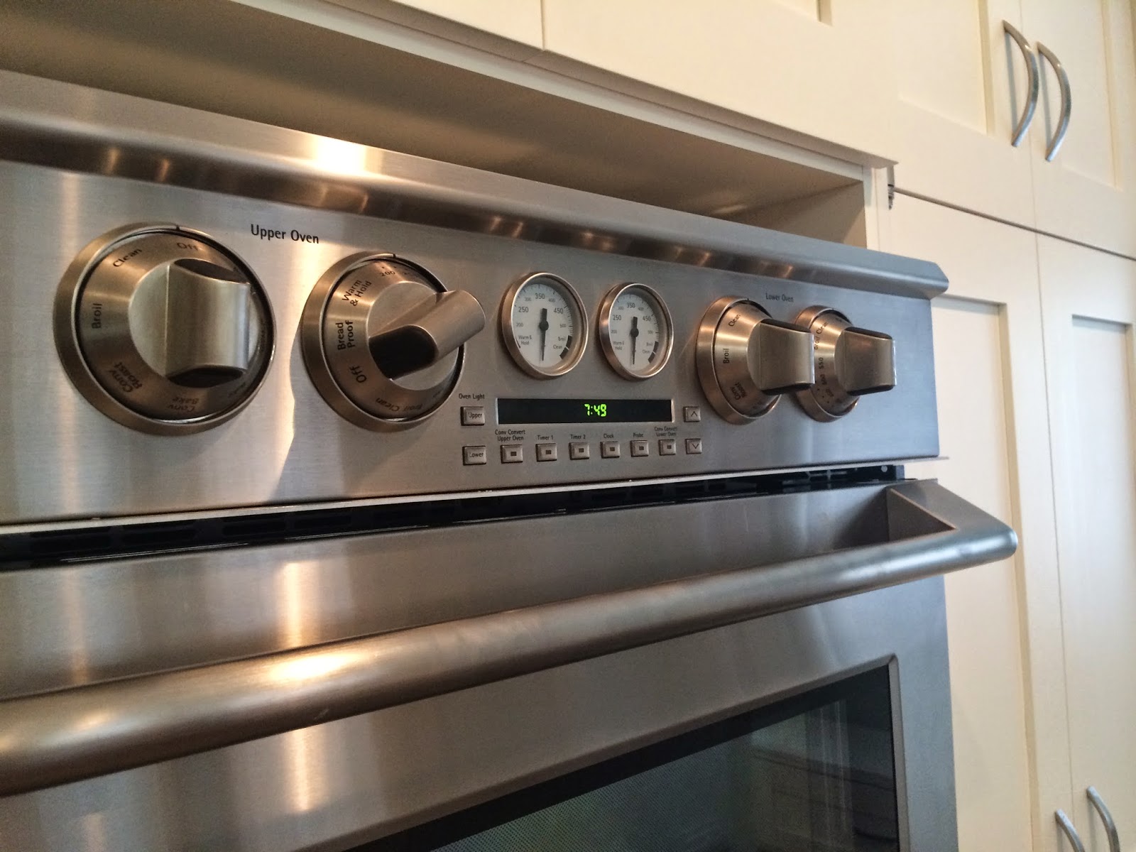
Cool digital/analog double ovens
I still have a few things to do. I need to make the window seat cushion and the roman shades for the windows. But it's 98% finished and I love it!!
If you stop by, tell me what you think!